Sephora
Accessibility Audit.
- Role
- Lead Accessibility Analyst
- Standard
- High-Contrast AAA (7:1)
- Scope
- E-Commerce Checkout Flow
- Impact
- 101 Issues Remediated
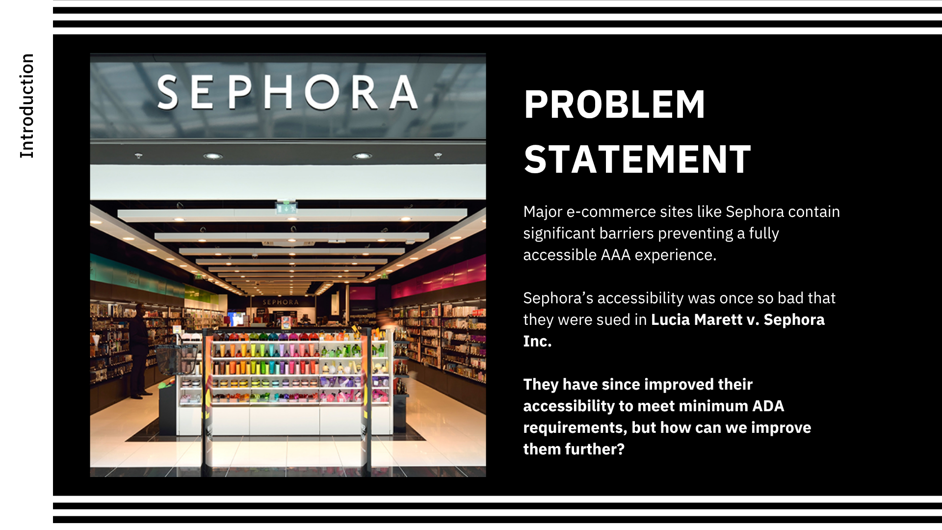
Beyond Minimum Compliance
While major e-commerce platforms often settle for bare-minimum compliance (following milestones like Lucia Marett v. Sephora Inc.), they frequently contain structural barriers that block independent shopping.
The Old Mindset
Treating accessibility as an afterthought, temporary fix, or reactive legal accommodation.
Our Approach
Engineering a robust, inclusive e-commerce system seamlessly from the ground up.
Foundational POUR Principles
Use arrow keys or click to explore how we evaluated Sephora's checkout flow against strict accessibility benchmarks.
Information and interface elements must be easily perceivable.
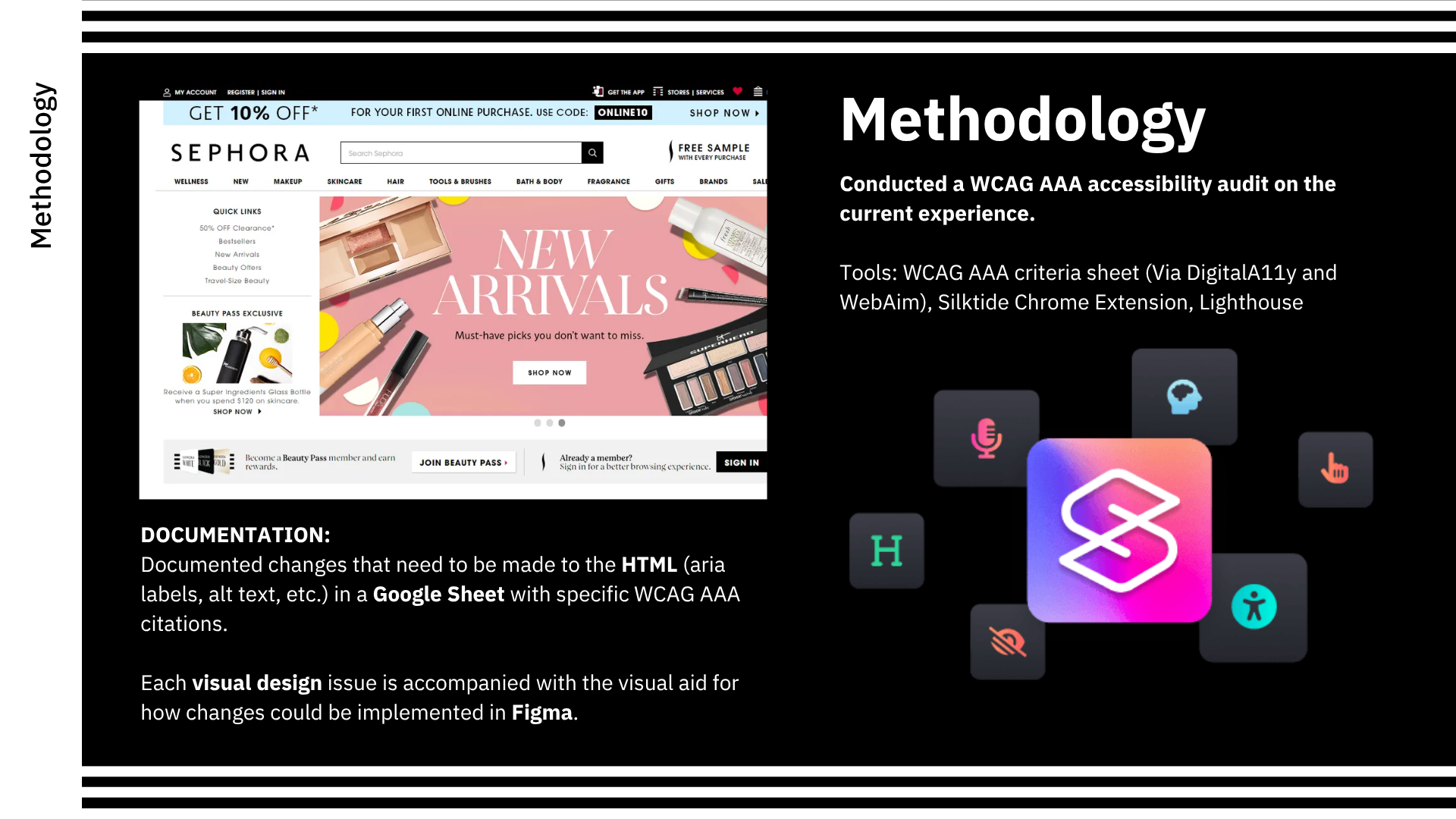
We verified that promotional graphics met strict contrast thresholds and replaced rasterized promo banner text with clean HTML layers and descriptive alternative text.
Multi-Step Evaluation Pipeline
We audited Sephora's complete checkout flow (cart, sign-in, shipping, payment, and confirmation) using an intensive, 4-stage testing protocol:
-
Tooling: WebAIM checklists, Silktide extensions, and Lighthouse automated audits.
-
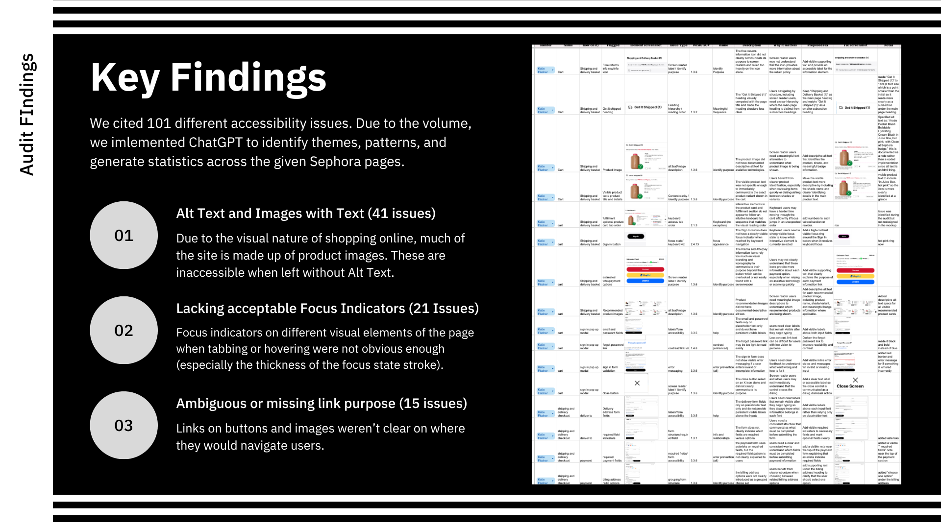
Matrix Logging: Documented 101 distinct accessibility friction points.
-
Figma Prototyping: Visualizing heading hierarchies and high-contrast focus rings.
-
Expert Review: Cross-referencing fixes with external accessibility specialists.
Statistical Distribution of 101 Logged Issues
Alt Text & Captions
Product imagery missing alt tags and promotional banners with embedded uncaptioned text.
Link Navigation
Ambiguous link text lacking explicit destination context when read out of sequence.
Focus Indicators
Default browser focus states lacking high-contrast visual perimeters for keyboard users.
Interactive Remediation Matrix
Select a category to examine the specific design systems solutions implemented across Sephora's checkout flow.
Descriptive Alt Text & Promotional Captions
Equipped all product thumbnails with detailed alt descriptions covering color, brand, and finish. Embedded promotional ad text was paired with explicit HTML caption layers so screen reader users never miss key sale terms.
Accessibility Knowledge Check
Read the e-commerce accessibility scenario below and select the correct remediation strategy to pass the challenge.